Working around mobile's 100vh issue
There's "100" and then there's "100"
Viewport units are a CSS unit of measure based on the size of the user’s screen; they are an intuitive and responsive way of sizing elements…most of the time. Unfortunately, they have a major problem on mobile devices: 100vh does not take up 100% of the screen. This is illustrated below:
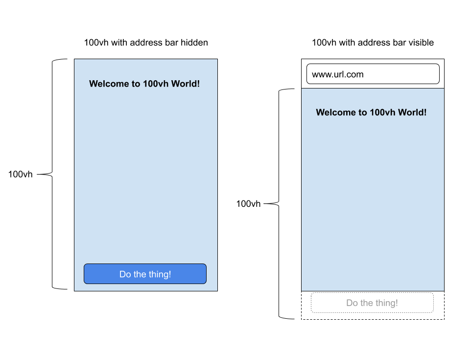
The image above was taken from David Chanin’s article “Avoid 100vh On Mobile Web”. Refer to this article for a more detailed account of this problem.
A partial solution
For a recent design I was working on, I wanted to control exactly what the user sees after the page loads. Viewport units are perfect for this as elements can be assigned pieces of the viewport up to 100vh (e.g. 10vh, 70vh, 20vh). This is enough for desktop browsers, but on mobile, 100vh extends past the end of the screen. What now?
- Use JavaScript to save
window.innerHeightto a CSS variable (which I calledivh). - Use
calcto compute height values scaled towindow.innerHeight
Example:
document.documentElement.style.setProperty('--ivh', `${window.innerHeight}px`);
.centerpiece {
  /* height: 70vh; */
  height: calc(var(--ivh) * 0.70);
}
The centerpiece div will take up the equivalent of 70vh on both desktop and mobile browsers. After the user scrolls past the first 100vh of the page, it is fine to use conventional vh units again as the URL bar will have shrunk.
Thoughts
The obvious question, “why does 100vh take up more than 100% of the viewport”, has an unsatisfying but reasonable answer (re-calculating viewport sizing while the URL bar shrinks looked awful).
I think a better solution would have been to simply not re-calculate viewport sizing during the transition. Start with 100vh including the URL bar and update once the URL bar finishes shrinking. Sizing would technically be incorrect during a transition, but this is a better trade-off then making it virtually impossible to create a full-viewport layout without JavaScript.